Inspiration through material
Nestled in one of Mumbai’s trendiest neighbourhoods, the Sorbet showroom of the bathroom brand Acquant is a surprising sight. This is precisely the feeling that the designers behind the project, the MuseLAB studio, wanted to create. ’For us, the design went far beyond recalibrating what “conventional” experience centres could look like. It was essentially a place that invited the child in all of us to come and play, to immerse themselves in the visual narrative and to create a space in which we could freely abandon all notions of what was expected at the door’, says the creative duo of Jasem Pirani and Huzefa Rangwala.
A DESIGN OF THE UNEXPECTED
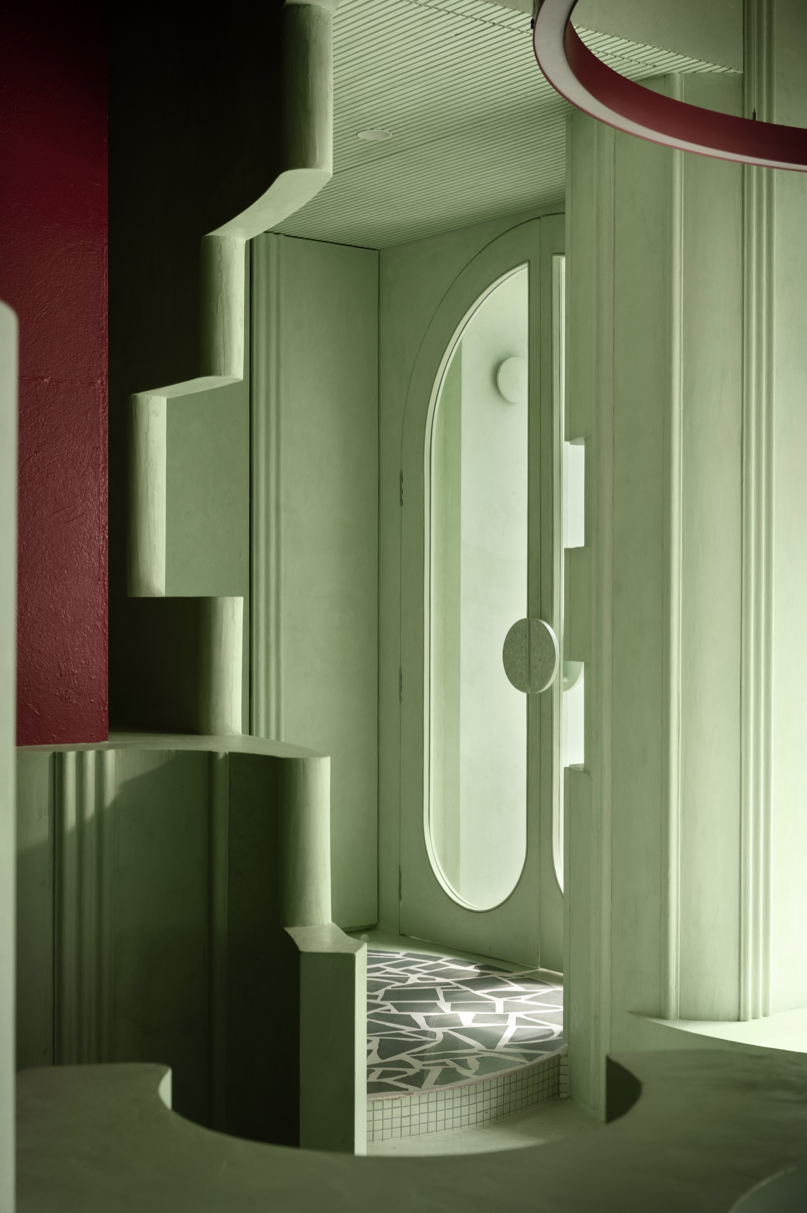
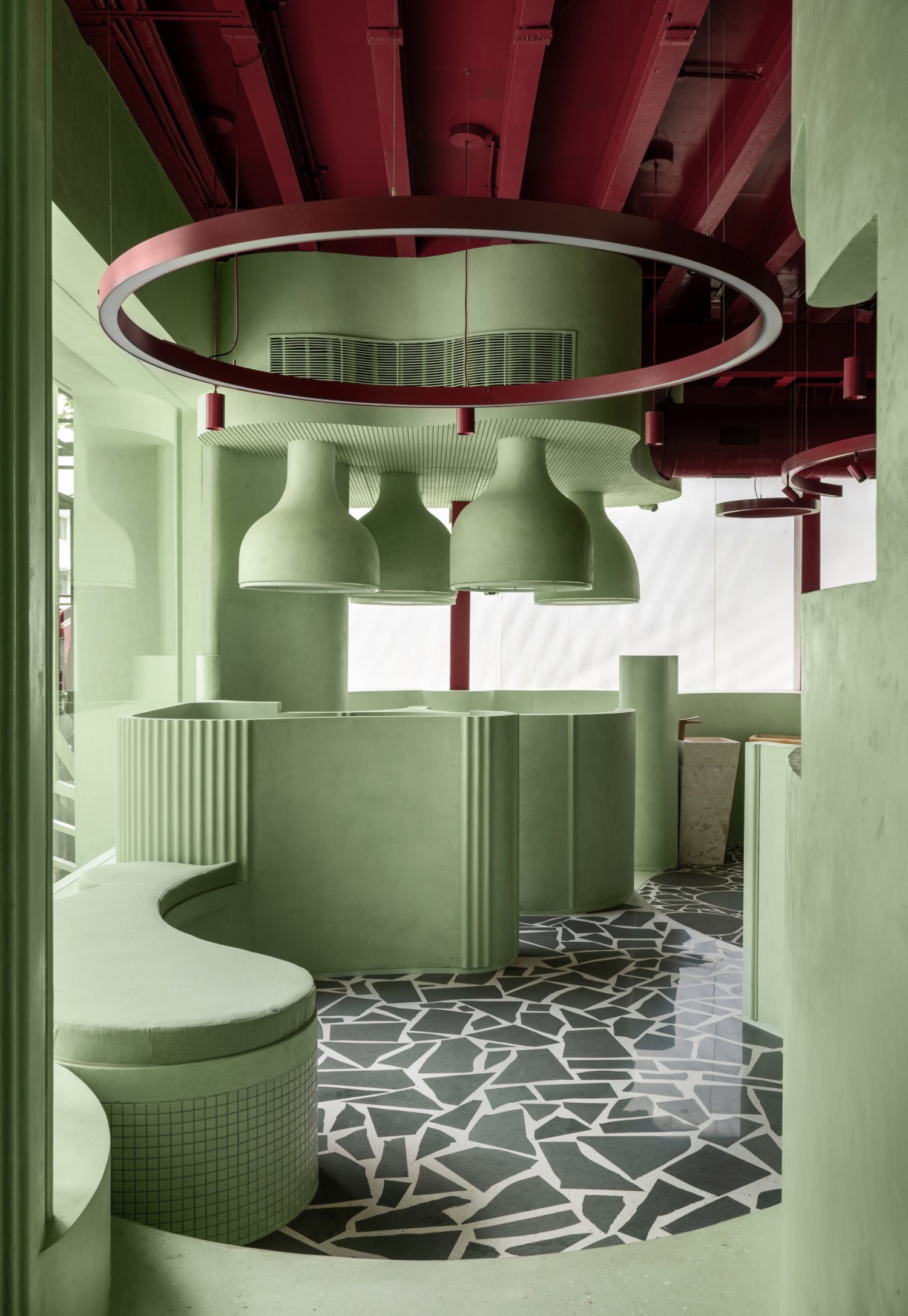
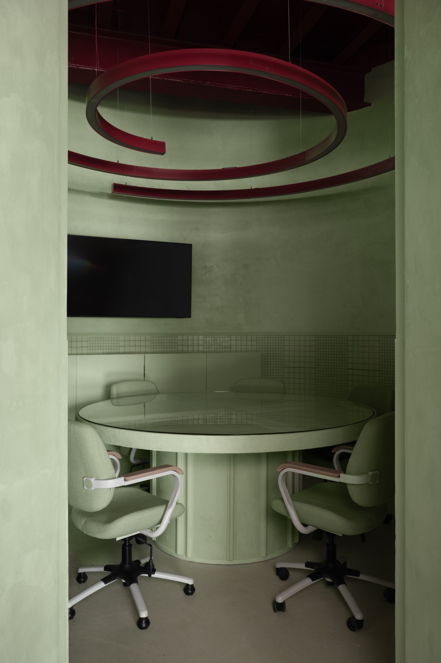
Surprise is unequivocally on the agenda in this showroom, which experiments with bold textures and colours, exploited to their maximum capacity. Upon entering the exhibition space, the visitor is struck by a shade of green that oscillates between mint and pistachio, that grows in intensity thanks to its omnipresence on every wall and display element. A second colour, a deep berry red, breaks up the tangy hue, taking pride of place on the technical equipment on the ceiling and the lighting fixtures, custom-designed for the space. Why the almost monochrome design choice? To showcase the Acquant elements. In the space, visitors to the showroom can experience the bathroom fittings in a surprising setting, which, according to the designers, invites them to take a different look at bathroom design, to make the process more fun and more creative. The very name of the studio is derived from the experience they seek to arouse: ’Sorbet is refreshing, cleansing the palate and instantly revitalising. It is the perfect metaphor for the flagship: just as sorbet awakens the taste buds, our aim is to refresh and revitalise the perspective of our visitors.’
A TEXTURED AND CIRCULAR UNIVERSE
A limited colour range that finds its diversity in the materials through which it manifests itself. Indeed, the tangy green, that occupies most of the space, is broken up by its various applications. On the walls and podiums , which serve as displays for presenting the products, it is applied with a textured paint, offering a understated yet noticeable contrast with the much more delicate appearance of the terrazzo and mosaic features. A palette broken up by the contrasting colour choices in the floor covering, made of Kota stones, available in a range of blacks and greys.
The rhythm of the space is set by the colours, but also by its geometry. The circle is thus made omnipresent. ’The movement is conceived as an arrangement of intersecting circles, creating semi-open enclosures housing product typologies. The circles have varying diameters and envelope heights, allowing the entire showroom to be perceived at a single glance. The display systems inside the enclosures are the result of a process of intense conceptualisation. Their curved and tiered shapes echo the dominant geometry. Bell-shaped pedestals, curved units extending from the enclosures, and circular display systems are scattered throughout the layout, creating moments during which clients can pause to discover the product range’, said the design duo. •
The façade already provides subtle clues, which then give way to visceral colours and elements. Inside, the look is comparable to that of green monoliths, the omnipresence of colours being punctuated by levitating bright halos and I-beams bathed in a red fruit colour. The design intention was simple: to allow customers to experience the full volume of the store from wherever they happen to be situated in the space, given the open views along the central axis of the volume formed by straight lines. The services are intentionally exposed, with heating, ventilation and air conditioning systems and ducts running the length of the space, in a matching marsala colour.
Yes, the tactile and sensory qualities of a material can be very important, particularly when it comes to the way things feel, work, or even inspire creativity. Textures have the role of adding the necessary depth to an object, influencing the way we interact with it, whether it is the smoothness of the polished terrazzo, the roughness of the textured paint or the softness of a fabric. We also find it fascinating to see how tactile experiences can affect mood or perception, or even enhance the products on display; in this particular showroom, the reflective surfaces of the products contrast beautifully with the rough, earthy texture of the paint.
For us, the material library most often plays a key support role throughout the design process, and it generally comes into play after the initial conceptualisation of a space. The conceptual phase always consists of getting the big picture, understanding the objectives, the ambience and the emotional tone of the space, while keeping the spatial layout and organisation in mind. Once these elements are in place, we bring in the appropriate materials that not only refine and enhance our ideas, but also echo the sentiments of the overall design philosophy. These materials help bring the concept to life and create the tactile or sensory experience of the space, making our projects tangible and alive. •
Year: 2024
Address: Mumbai, India
Space and furniture design: MuseLAB
Materials: Terrazzo of Kota stone and mosaic
Surface area: 280 sqm